Selected work

Real work, clearly explained.

Explore the websites, the decisions behind them and the marketing that connects the next steps.

Selected work

Nauyokas Insurance Agency

Make insurance guidance approachable and the quote path easy to find.

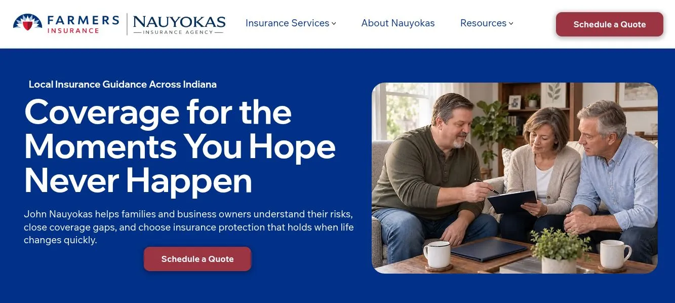
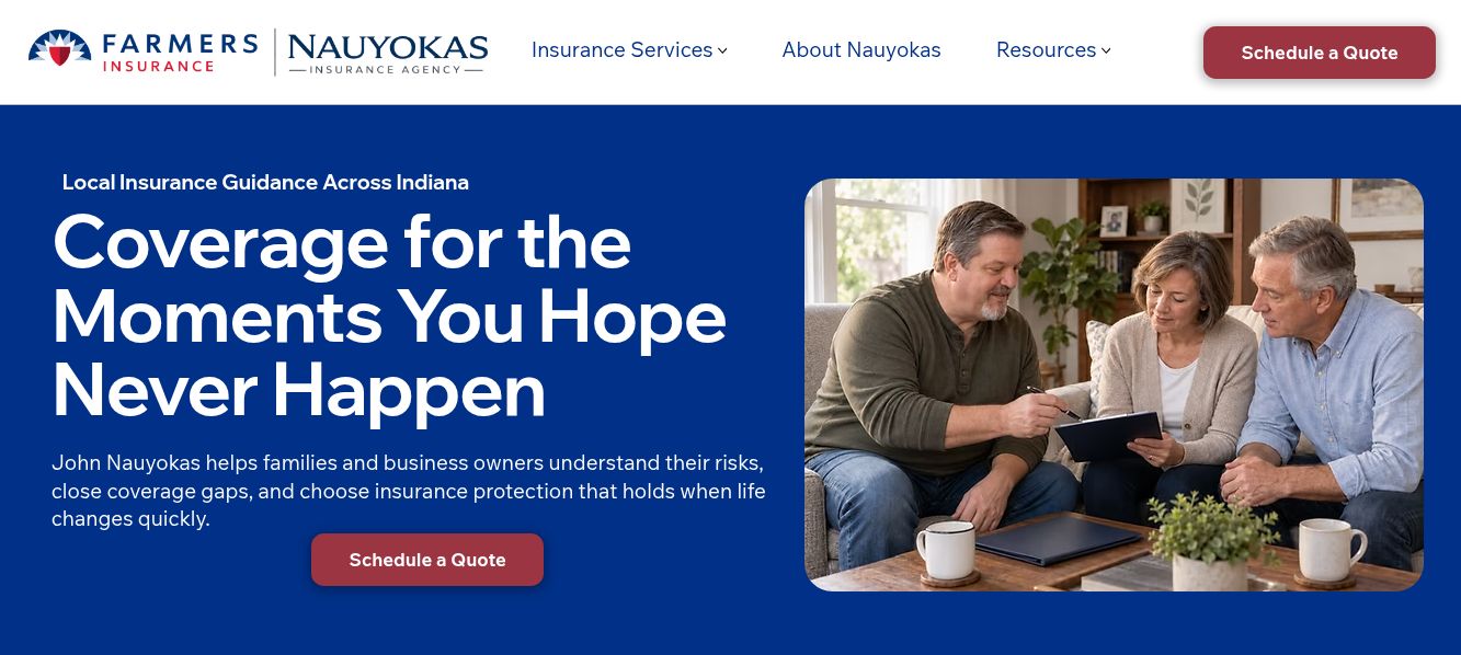
Nauyokas Insurance Agency homepage with local insurance guidance, coverage messaging and a Schedule a Quote call to action.
Homepage and quote pathEnlarge image

Grant’s contribution

Positioning and messaging, user experience and SEO, with implementation in Wix.

View project

Messaging · Website · Quote journey

What could your website do better?

Tell me what you need to communicate and what you want people to do next. I'll review your inquiry and suggest a next step.

Selected work

Website improvements · Email design · Automation

Dig Dig for Kids

A parent needs to compare visit lengths and prices, or find out what a birthday party includes before making plans.

Grant’s contribution

Website strategy and user experience, copywriting and SEO, plus WordPress and ecommerce.

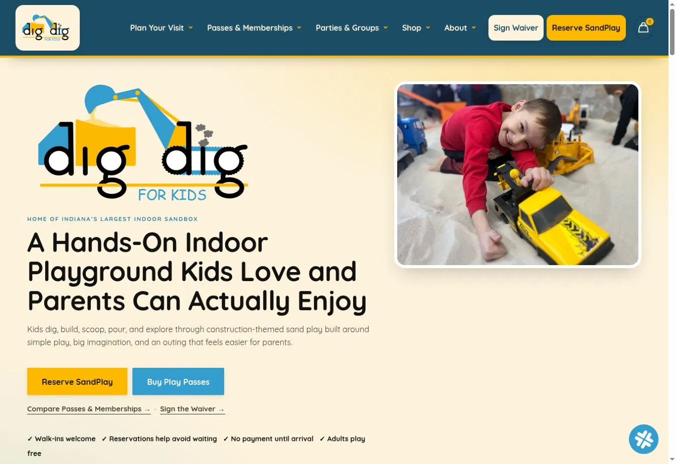
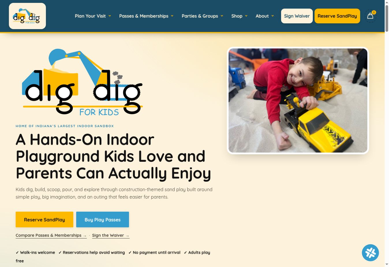
Dig Dig for Kids homepage with indoor playground messaging, visit navigation, play-pass links and a child playing in sand.Enlarge image

Homepage and visit planning

  1. Decision 01

    Choose a way to play.

    What I changed
    I organized play passes by visit length, with prices and benefits together.
    Why it matters
    Parents can compare the options before deciding how long to stay.
    Dig Dig for Kids passes and memberships page with one-hour, four-hour and eight-hour play-pass comparisons.Enlarge image
  2. Decision 02

    Plan the party separately.

    What I changed
    I gave birthday parties their own path, with the experience, space and planning details in one place.
    Why it matters
    A parent arranging a celebration needs different information from someone planning an ordinary visit.
    Dig Dig for Kids birthday party page explaining the party experience for children and parents.Enlarge image

The transformation

Earlier layout. Current work.

Earlier homepage layout
Earlier Dig Dig homepage body with a sand background, centered logo, headline and small visit actions.Enlarge image
Current homepage
Current Dig Dig homepage body pairing a parent-focused introduction with a photograph of a child playing.Enlarge image

Earlier body layout retained at /home/, last edited July 6, 2026. Current homepage captured September 17, 2026, including updates after its July publication. Both show equivalent opening sections; the retained page uses today’s shared navigation.

Selected work

Messaging · Website · Quote journey

Nauyokas Insurance Agency

A visitor needs to understand the kinds of coverage available and how to ask for guidance.

Grant’s contribution

Positioning and messaging, user experience and SEO, with implementation in Wix.

Nauyokas Insurance Agency homepage with local insurance guidance, coverage messaging and a Schedule a Quote call to action.Enlarge image

Homepage and quote path

  1. Decision 01

    Start with the coverage question.

    What I changed
    I organized coverage information around recognizable needs, with plain-language service descriptions.
    Why it matters
    Visitors can identify the kind of help to ask for without starting with insurance terminology.
    Nauyokas Insurance Agency coverage section presenting auto, home and life insurance services.Enlarge image
  2. Decision 02

    Make the adviser visible.

    What I changed
    I brought the founder’s introduction into the website alongside the service information.
    Why it matters
    Insurance is a personal decision. Seeing the person offering guidance adds useful context before a conversation.
    Nauyokas Insurance Agency founder story describing the founder’s approach to insurance.Enlarge image
  3. Decision 03

    Keep the quote route in view.

    What I changed
    I placed a clear quote invitation in the navigation and the opening section.
    Why it matters
    Someone ready to talk can find the next step while others continue exploring coverage.
    Nauyokas Insurance Agency homepage with local insurance guidance, coverage messaging and a Schedule a Quote call to action.Enlarge image

Selected work

Brand identity · Website · Booking journey

Hot Horns

An event organizer needs to judge whether the ensemble suits a school, concert, festival, or outdoor event, then find a way to ask about booking.

Grant’s contribution

Brand direction, user experience and copywriting, with Wix implementation and the booking flow.

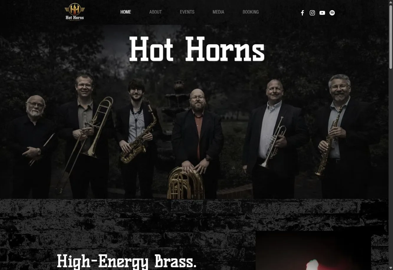
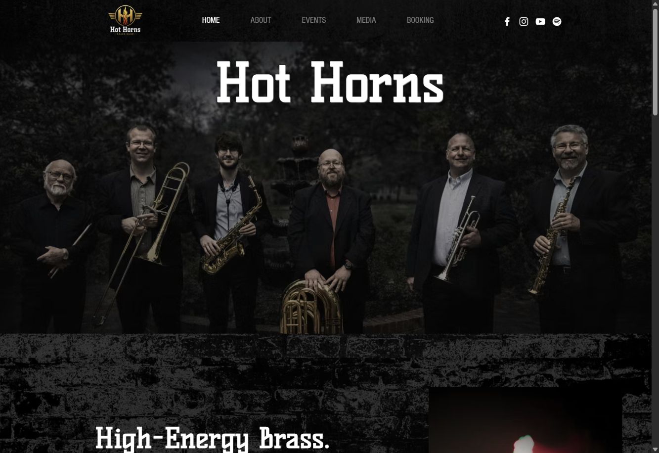
Hot Horns homepage with the ensemble’s name, band photograph, performance identity and booking navigation.Enlarge image

Homepage and performance identity

  1. Decision 01

    Let the band set the tone.

    What I changed
    I brought the ensemble photograph, bold typography and band identity together at the opening.
    Why it matters
    An organizer gets a sense of the performers before reading through the practical options.
    Hot Horns homepage with the ensemble’s name, band photograph, performance identity and booking navigation.Enlarge image
  2. Decision 02

    Connect the event to a booking.

    What I changed
    I separated school, concert and outdoor performance options, each with a booking invitation.
    Why it matters
    Organizers can assess the fit for their event and follow the relevant route to an inquiry.
    Hot Horns page showing school, concert, festival and outdoor performance options.Enlarge image

The transformation

Earlier layout. Current work.

Earlier web presence, March 2026
March archive of Hot Horns on Bay Street Brassworks with a blue header, ensemble photograph and introduction.Enlarge image
Current website, September 2026
Current Hot Horns website with prominent band identity, ensemble photograph and booking navigation.Enlarge image

Earlier: March 6 archive of baystreetbrassworks.com/hothorns. Current: hothorns.com, captured September 17, 2026. These are different domains and routes.

Use full size to read the details. Scroll or use arrow keys to move around the image.